paletteDesign System
The visual identity of La République des Cartes
Logos, colours, typefaces, textures and shapes: everything you need to speak with one voice, whether you are running a workshop, printing a poster or posting on social media. Every element can be downloaded straight from this page.
translateThe brand guide itself, and the pages from it shown below, are only available in French.
Downloads
The source files, sorted by family. The complete kit contains all of them.
inventory_2Complete brand kitZIP · 10.5 MBLogos, typefaces, backgrounds, shapes, social media covers, templates and website guide.downloadDownloadwebWebsite guidePDF · 3 MB · 8 pages · in FrenchHow the brand guide applies to the website.downloadDownloadverifiedLogosZIP · 2 MBThe 5 forms of the logo, in colour and monochrome, for light and dark backgrounds, as SVG and PNG.downloadDownloadtext_fieldsTypefacesZIP · 0.8 MBSora, Newsreader Text and Newsreader Caption, under an open licence (OFL).downloadDownloadtextureBackgrounds and texturesZIP · 3.4 MBThe map backgrounds and the grid, in high resolution.downloadDownloadcategoryShapes and symbolsZIP · 8 KBSilhouette and Territory masks, topographic decoration, symbols.downloadDownload
Logo
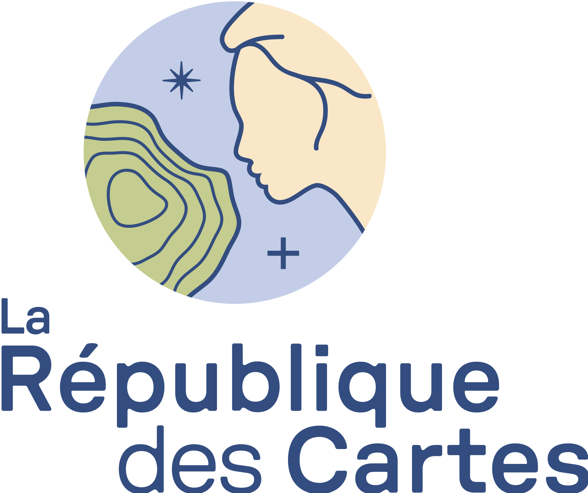
The logo evokes a poetic, balanced meeting between human society, embodied by a silhouette, and the mapped territory. From this union a new world is born, a reminder that maps are precious tools for thinking, understanding, finding our way and coming together.
- Pole star
- A guide, a reliable landmark that helps us find our way. It embodies many European epics.
- Territory
- A nod to cartography. The topography evokes the different ways a map can be read.
- Plus
- Stands for Cartesian precision, but also for connection and coming together.
- Logo typeface
- GT Pressura Extended, Medium and Regular. Its imperfect lines recall the old craft of mapmakers and the heritage of institutes such as IGN. It is reserved for the logo: do not reset it, use the files provided.
The five forms of the logo
Choose the version and the background the logo will sit on, and you get the right file. Prefer the vector SVG; the PNG is there for when SVG is not accepted.

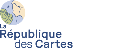
Left-aligned
min. 150 pxThe preferred version for large formats, or when the logo takes up much of the space.

Badge
min. 50 pxA reminder of the logo when it repeats: signature, icon, social media profile.
Wordmark
min. 70 pxA reminder of the logo when it repeats: signature, footer, header.
Variants for social media and the web
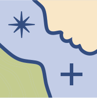 Square profileSocial media profile picture.downloadSVG
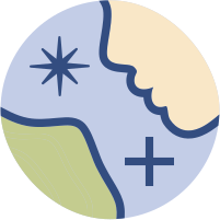 Round profileProfile picture for networks that crop it round.downloadSVG
 Favicon 1Browser tab icon, on a light background.downloadSVG
 Favicon 2Browser tab icon, variant.downloadSVG
Rules of use
Clear space
Leave clear space around the logo equal to a quarter of its size. No text or graphic element may enter it.
Logo on a coloured background
Mind the contrast. Every version of the logo exists for light and for dark backgrounds: use the one that matches yours.
Logo on an image
The logo must remain clearly visible. Soften the image with a gradient, or place the logo on one of the masks from the graphic world.
Monochrome logo colours
The monochrome version may only be used in these six colours.
blockWhat not to do
Only use the logo files provided. Do not:
- closeUse a typeface other than the logo’s
- closeUse colours that are not specified
- closeChange the layout or the proportions
- closeDistort the logo
- closeRotate the logo
- closeAdd effects, such as shadows
Colours
Primary colours should be used most of the time. Neutrals are preferred for text. Secondary colours are only for small touches and decorative elements. Click a colour to copy its code.
Primary colours
To be used most of the time.
Neutral colours
Preferred for text.
Secondary colours
In small touches only, for decorative elements or to make something stand out.
Extended palette
The shades of each family, for gradients, backgrounds and illustrations.
Blue
150
200
250
400
600
700
800
900
Green
200
300
400
500
600
700
800
850
Brown
150
200
250
400
600
700
800
900
Black
50
100
150
200
500
White
900
930
960
990
Secondary
Coral
Yellow
Red
Combining colours
Mind the contrast: text must always remain readable on its background. The guide shows the combinations of blues that work.
Typography
Three families, all free to use and available on Google Fonts. The kit includes the files.
Let’s reinvent our territories, together.
Revealing the power of maps as a democratic lever, so that everyone can take hold of them.
ABCDEFGHIJKLMNOPQRSTUVWXYZ · abcdefghijklmnopqrstuvwxyz · 0123456789 · éèàçœ
Let’s reinvent our territories, together.
Revealing the power of maps as a democratic lever, so that everyone can take hold of them.
ABCDEFGHIJKLMNOPQRSTUVWXYZ · abcdefghijklmnopqrstuvwxyz · 0123456789 · éèàçœ
Captions and notes
Newsreader Caption
Regular, Medium, Semi Bold, and their italics
Let’s reinvent our territories, together.
Revealing the power of maps as a democratic lever, so that everyone can take hold of them.
ABCDEFGHIJKLMNOPQRSTUVWXYZ · abcdefghijklmnopqrstuvwxyz · 0123456789 · éèàçœ
Text styles for print
Indicative sizes in points, based on an A5 document: adjust them to the size of your format.
| Style | Typeface | Size | Leading | Colour |
|---|---|---|---|---|
| H1 | Sora Semi-bold | 24 pt | 24 pt | Blue 200 |
| H2 | Sora Semi-bold | 12 pt | 12 pt | Green 300 |
| H3 | Sora Regular | 12 pt | 12 pt | Green 400 |
| Body text, level 1 | Newsreader Text | 11 pt | 12 pt | Black 50 |
| Body text, level 2 | Sora Regular | 9 pt | 12 pt | Black 50 |
| Notes | Newsreader Caption | 7 pt | 9 pt | Black 500 |
Text styles for slide decks
For a 16:9 slide deck (1920 × 1080).
| Style | Typeface | Size | Leading |
|---|---|---|---|
| H1 | Sora Semi-bold | 120 pt | 110 pt |
| H2 | Sora Semi-bold | 80 pt | 80 pt |
| H3 | Sora Regular | 45 pt | 52 pt |
| Body text | Newsreader Text Regular | 40 pt | 46 pt |
| Notes | Newsreader Caption Regular | 24 pt | 30 pt |
| Captions | Newsreader Caption Regular | 16 pt | 22 pt |
Layout
Shared margins and grids give every format a family resemblance.
Margins
| Format | Margin |
|---|---|
| A4 | 1.5 cm |
| A5 | 1 cm |
| Instagram post (1080 × 1350) | 60 px |
| Slide deck (1920 × 1080) | 60 px |
Grids
Roll-up banner: 3 columns and 2 rows in landscape, 4 columns and 3 rows in portrait. The A5, A4, A3 and web (1440 × 1080) grids are detailed in the guide.
Graphic world
Map textures, masks and symbols: the elements that make the identity recognisable at first glance.
Backgrounds and textures
Keep contrast low between backgrounds and the textures placed in masks. On the website, never put two textured backgrounds one after the other.
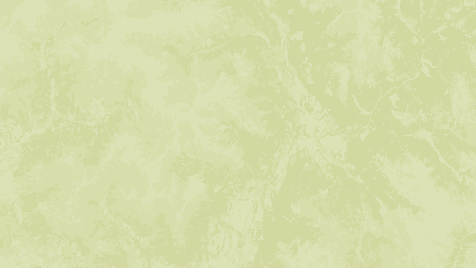
Green map
PNG · 1920 × 1080A background, or a texture to place inside a mask. The site’s light textured background.
downloadDownload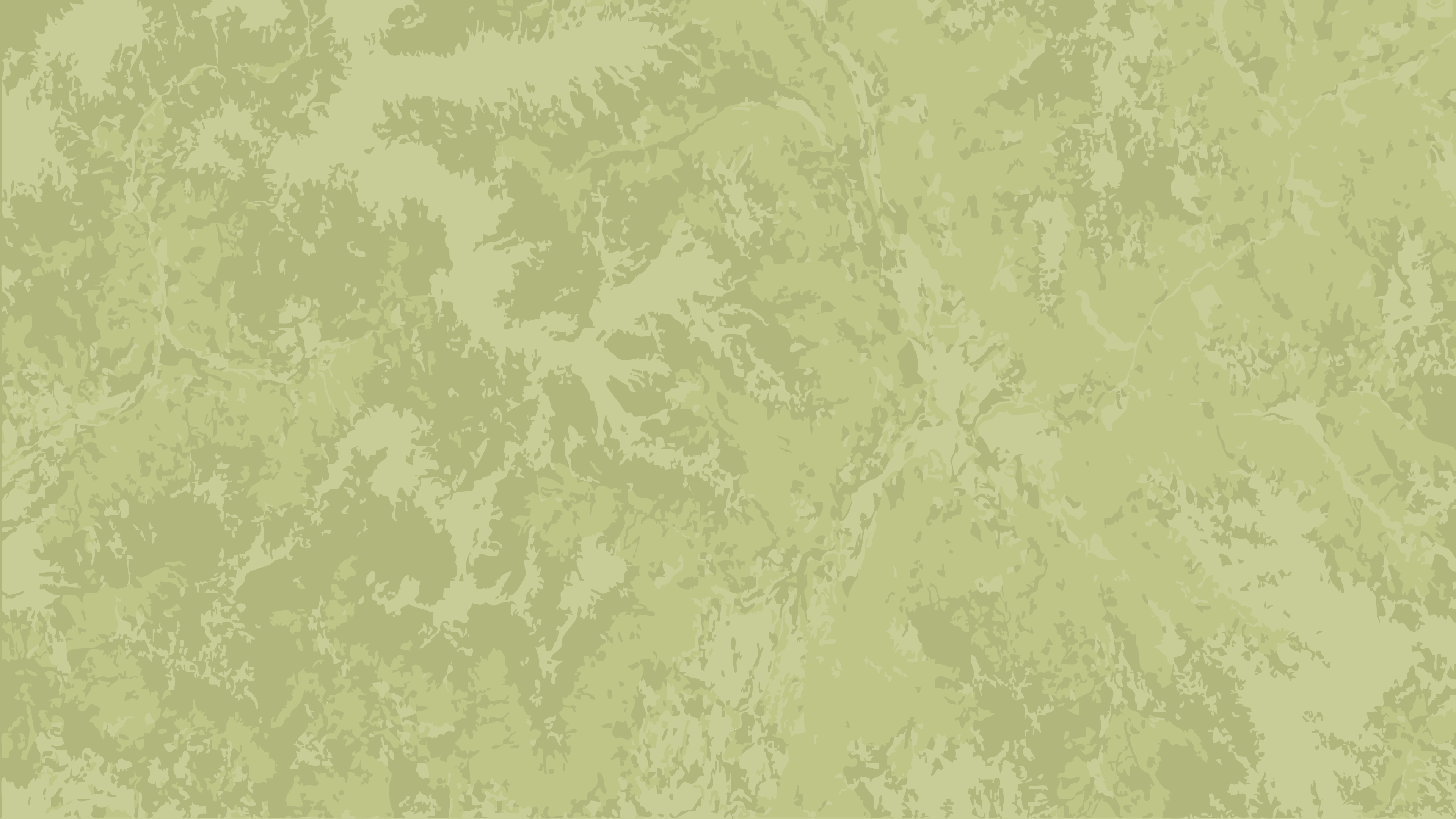
Green map 02
PNG · 3840 × 2160A background, or a texture to place inside a mask.
downloadDownload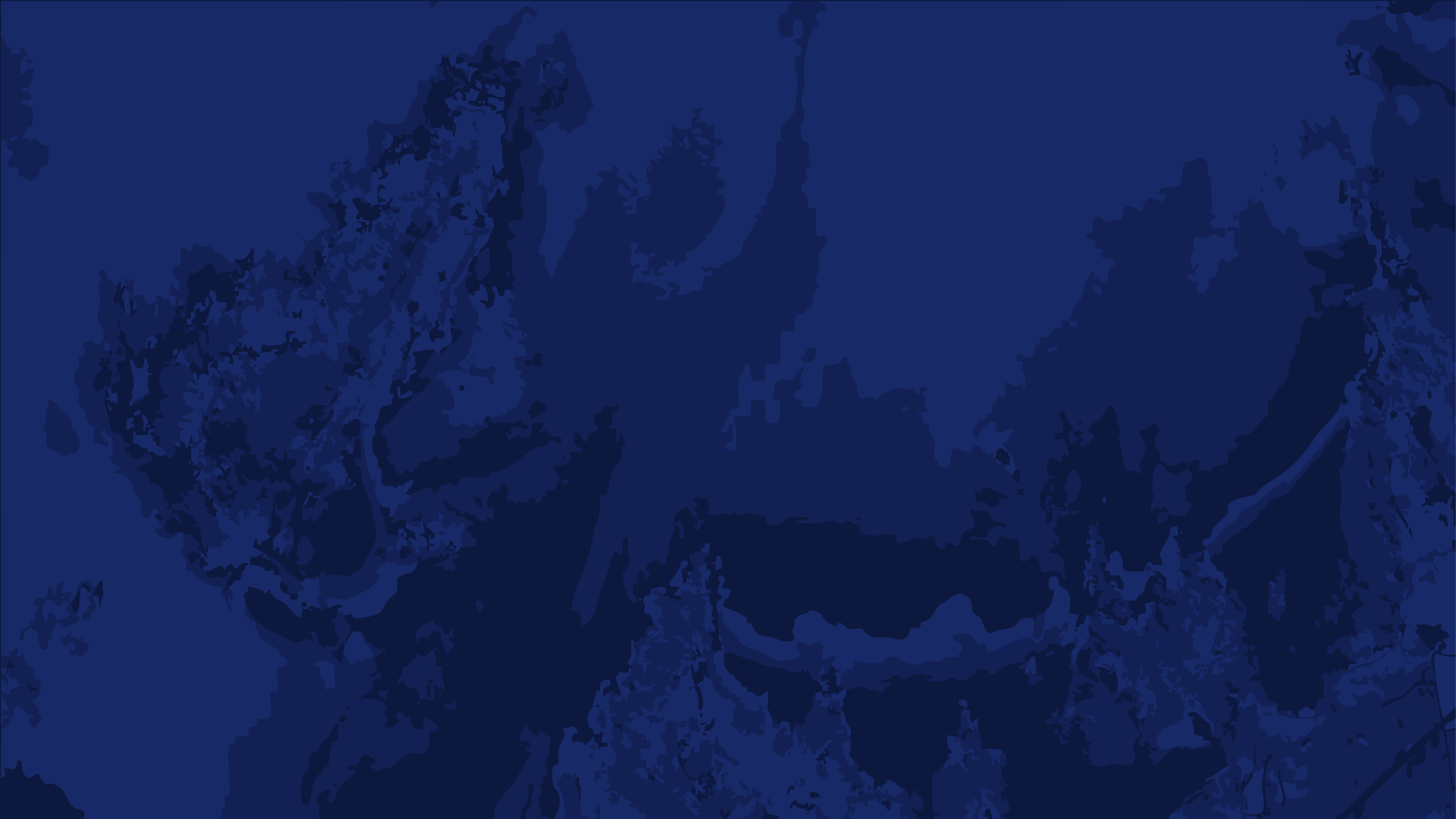
Navy map
PNG · 3840 × 2160A background, or a texture to place inside a mask. The site’s dark textured background.
downloadDownload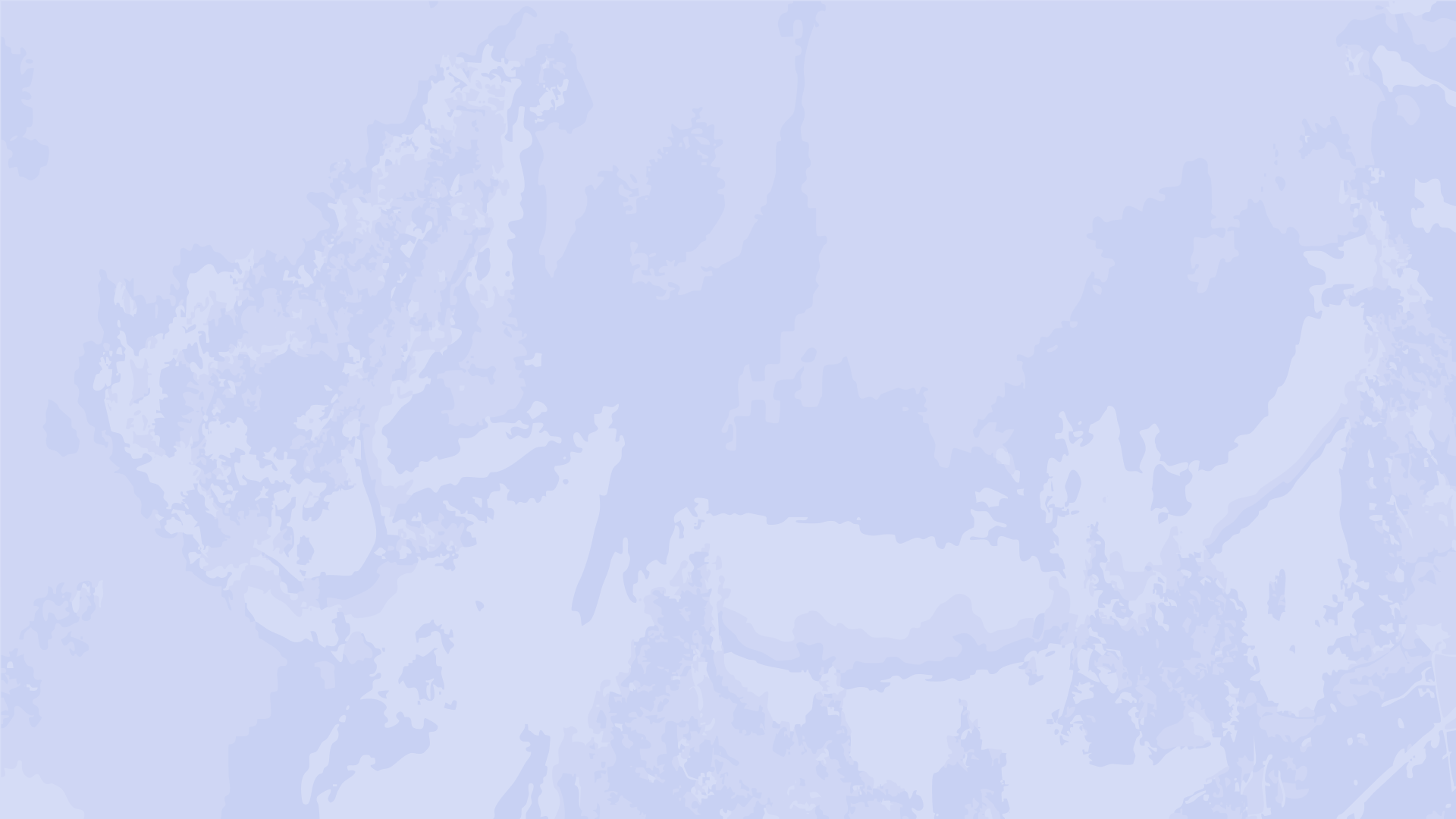
Blue map 01
PNG · 1920 × 1080A background, or a texture to place inside a mask.
downloadDownload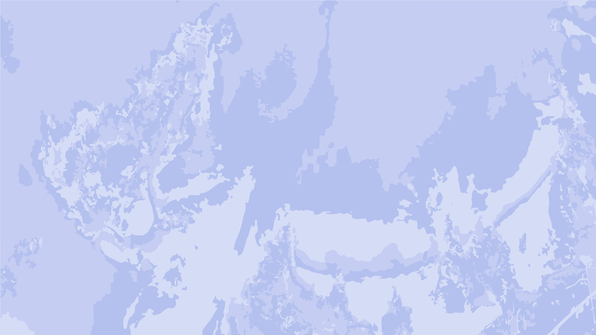
Blue map 02
PNG · 1920 × 1080A background, or a texture to place inside a mask.
downloadDownload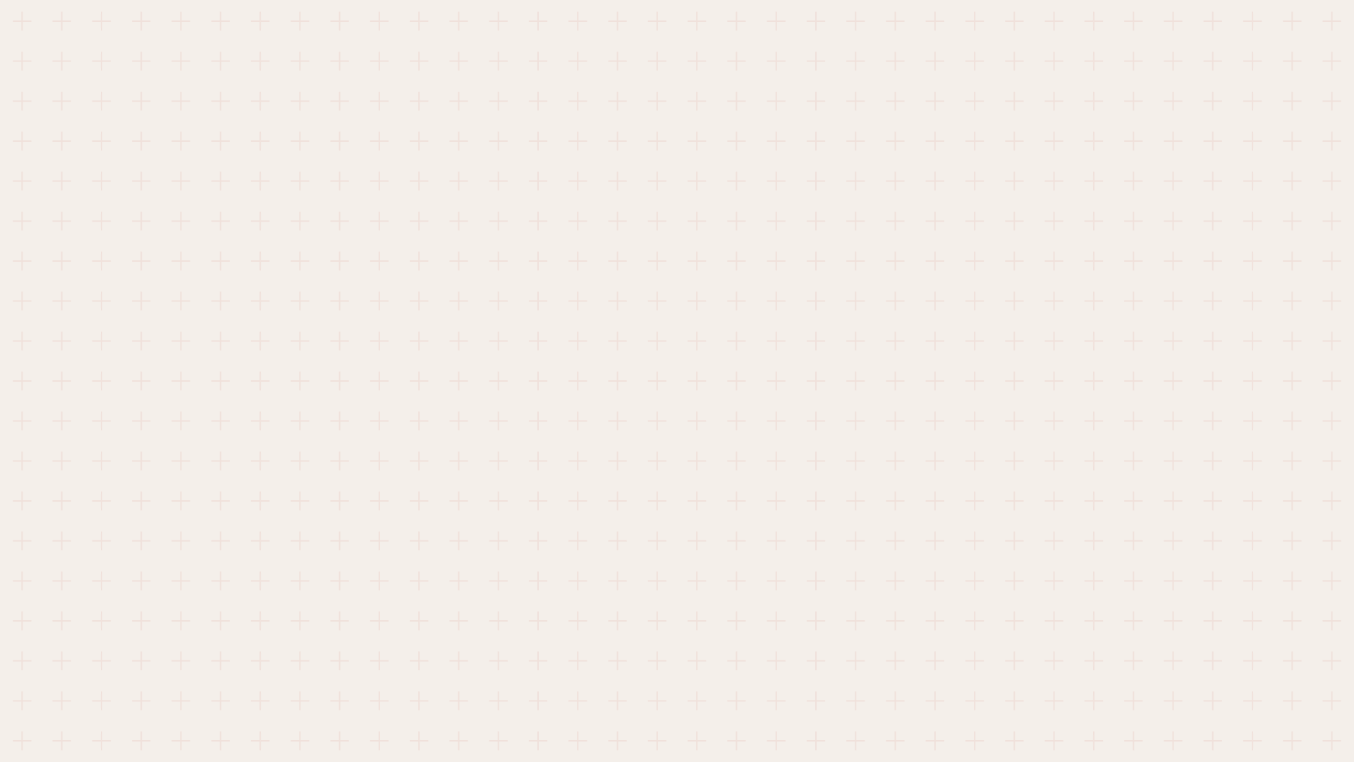
Grid
PNG · 1920 × 1080A background. Adds depth.
downloadDownloadShapes
Masks
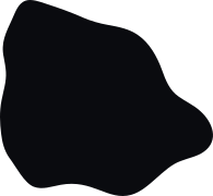
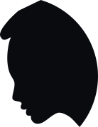
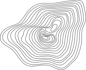


Placing the masks
In the corners, bleeding off the edge; in the header and footer; or in a mixed composition. The angle and position of the shapes may vary from page to page.
Partner logos
When a document features partners:
- check_circlePlace partner logos in the footer.
- check_circleIf there are few enough, line them up on a single row.
- check_circleOn vertical formats, place them inside the Silhouette mask, in the footer.
- check_circleThe La République des Cartes logo is always larger than the partners’ logos.
Applications
Examples of materials made with the guide, for inspiration.
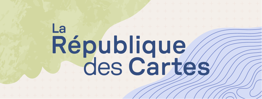
Social media covers

Website
A reduced palette, drawn from the main one, keeps the website consistent. The CSS variables are those used in the site’s code.
Contrast of the site’s colour pairings
Calculated according to the WCAG accessibility rules: at least 4.5:1 for body text, 3:1 for large text (24 px, or 19 px bold).
Cartes sur table
Black 50 on White 99019.2:1 · AA
Cartes sur table
Blue 250 on White 99013.2:1 · AA
Cartes sur table
Blue 250 on White 93011.7:1 · AA
Cartes sur table
White 990 on Blue 25013.2:1 · AA
Cartes sur table
Blue 900 on Blue 2509.9:1 · AA
Cartes sur table
Coral on Blue 2505.4:1 · AA
Cartes sur table
Black 50 on Coral7.9:1 · AA
Cartes sur table
White 990 on Coral2.4:1 · Insufficient
Typefaces and backgrounds
- Sora — Regular and Semi Bold, for headings and buttons.
- Newsreader Text — Regular and Semi Bold, with their italics, for paragraphs.
- Newsreader Caption — Regular and Semi Bold, with their italics, for captions.
- Textured backgrounds — Green map (on White 930) and Navy map (on Blue 250). Never two textured backgrounds in a row.
Website guide
Page 1
Templates
Documents ready to fill in, already set in the brand’s colours and typefaces.
The complete brand guide
The pages of the guide (in French), to browse here. Use the arrow keys, or jump straight to a chapter.
Page 1